300dtd-finance-website
Sprint 3 - A Refined and Complete System
Sprint Goals
Develop the system until it is fully featured, with a refined UI and it satisfies the requirements. The system will be fully tested at this point.
Final Implementation
The web app is fully implemented with a refined UI:
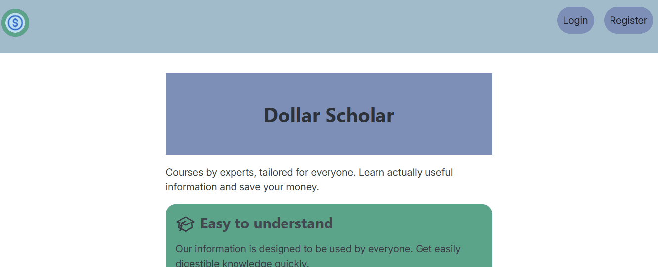
Landing page
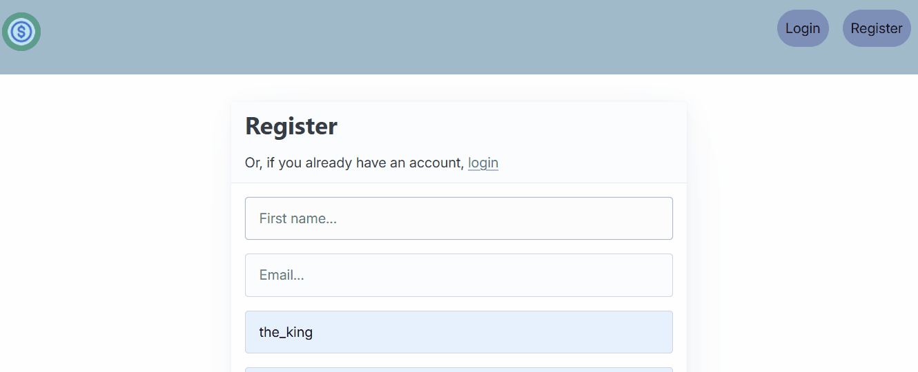
Account registration
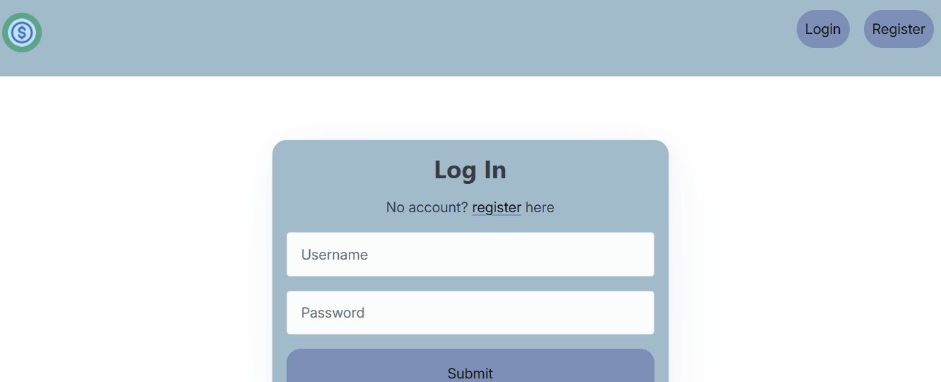
Logging in

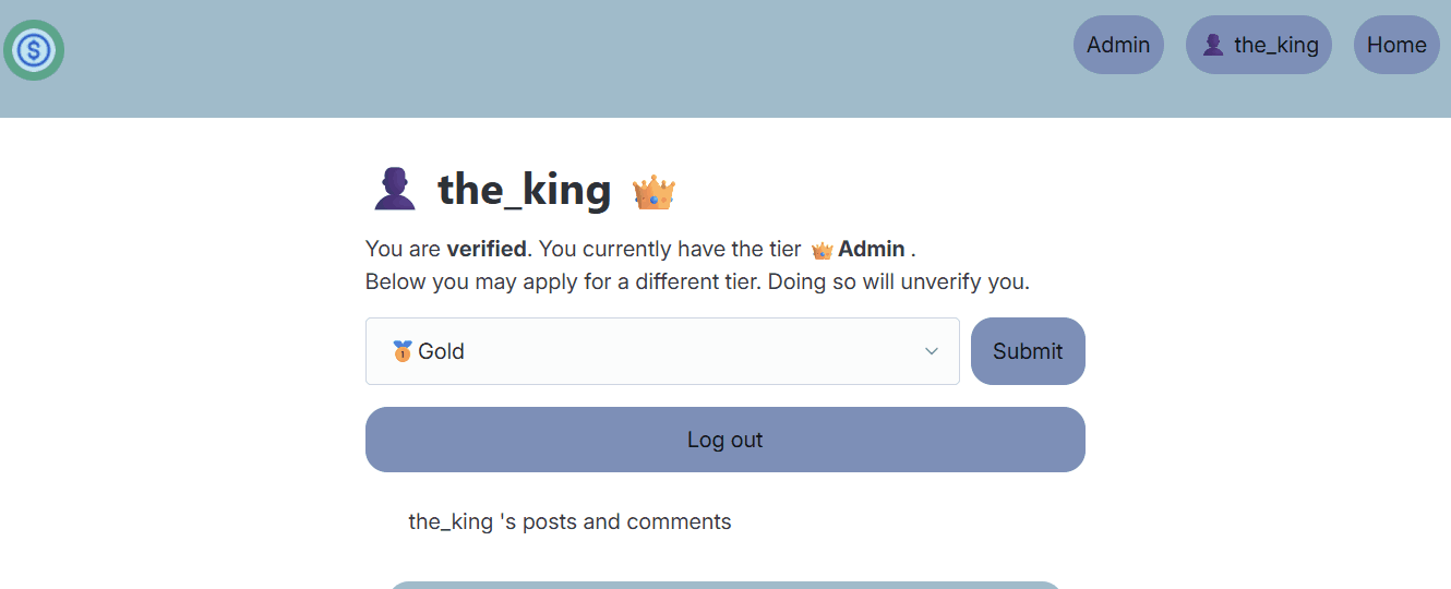
Account Verification
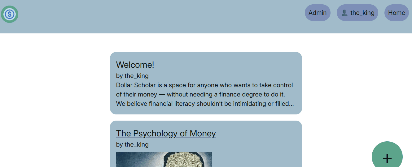
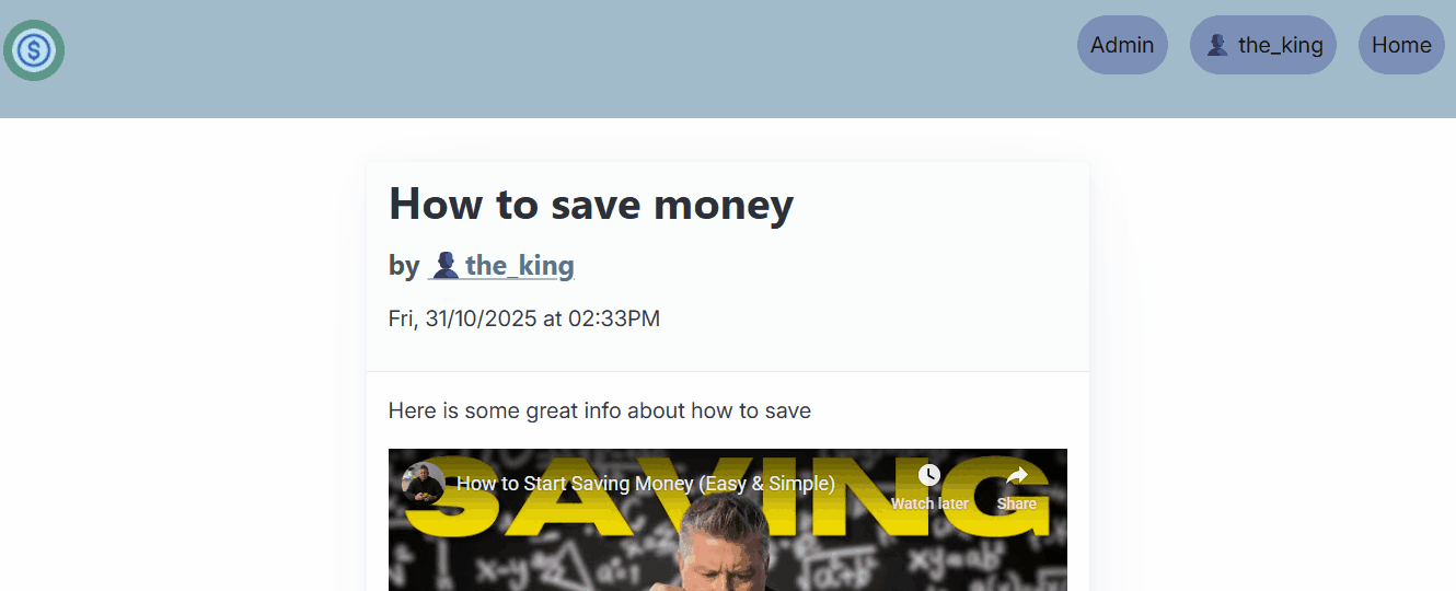
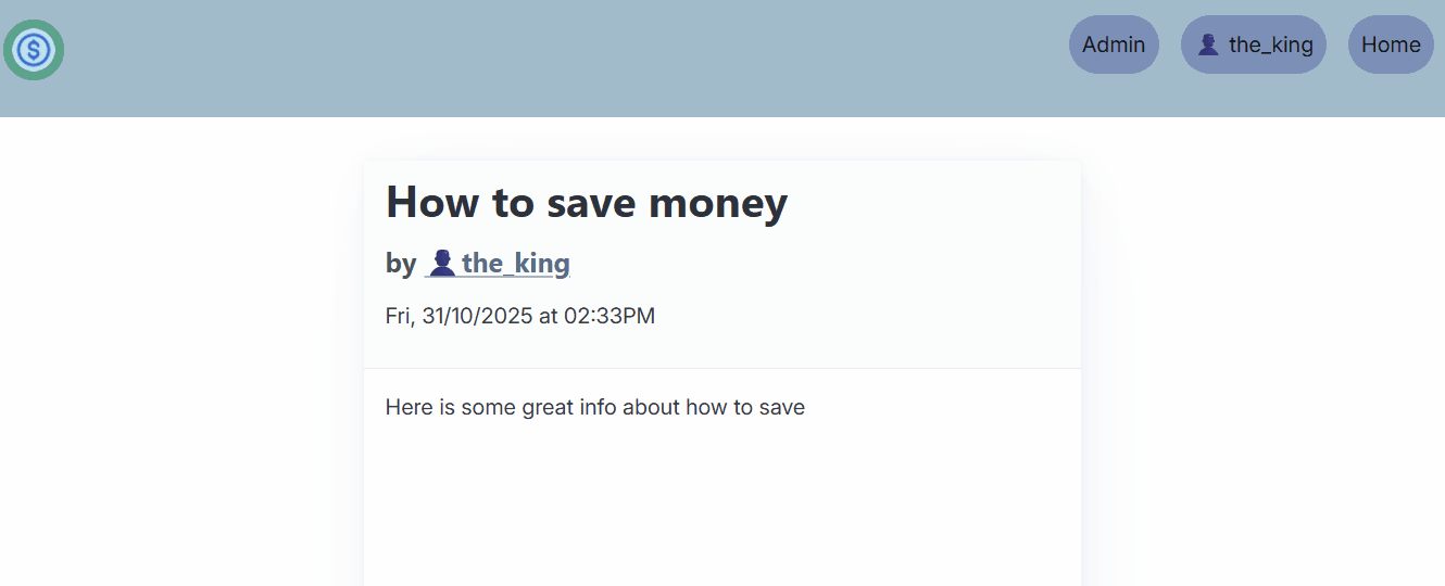
Making a post
Making and deleting comments
Deleting a post
User without adequate tier
User Interface Changes
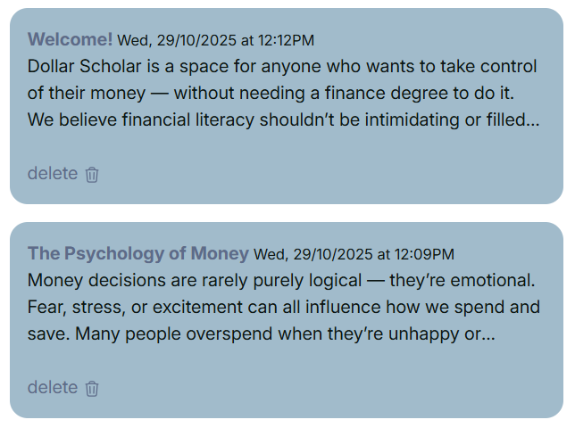
Just having the text “delete” looks a little bit unrefined, common website conventions would use an icon. During my latest meeting with my client, I asked about whether or not he felt an icon would be better.
“Well I think having the delete text is fine, but for accessibility and icon would be beneficial as well. Could you put a bin icon next to it?”
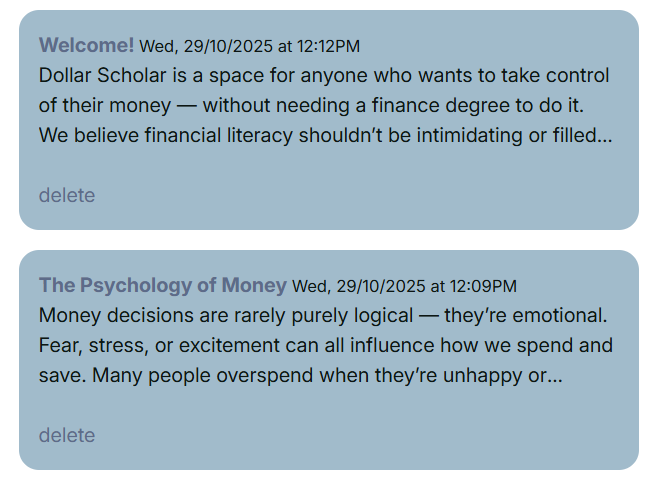
I then followed this sentiment and added an svg icon next to the delete text. I will follow this convention through out the site, to keep things accessible for everyone.
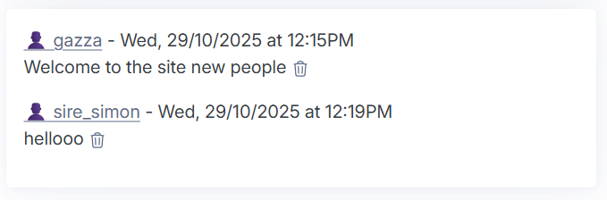
I also realised that whilst posts had a readable date and time, the comments did not.

This would not fit with the rest of the site and it is not very friendly for users to read, so I added a format that is consistent with the rest of the site.
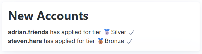
Another piece of feedback I got from my client was:
“It would be good if it also said the name of the tier next to the tier icon, just so I can easily read it”
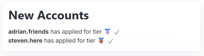
To resolve this, I used a jinja filter to add the text next to the icon.
Sprint Review
This sprint went very smoothly and quickly. It just consisted of me styling the site and making slight adjustments and tweaks to things. I already knew what the site was supposed to look like because of my figma mockup that I made for my client.